George Macdonald - 28. März 2018
We have a new corporate design - and our logo has been refreshed. A logo is very personal to every company. In an instant it makes a statement which is easily recognisable. It says whether you view your company as dynamic, reliable, trendy, conservative, friendly, or efficient.
When I first designed our logo in 1995, I drew it using Word – three pieces of a square aligned to form an “M”. The three pieces were intended to represent the three pillars of our business case – software, consulting and projects.
In the intervening 23 years, the logo has changed only slightly – the colour has migrated to blue and the word MACD now follows it (we bought the web address macd.com in 1999 for $750 from a NYSE listed company).
But it was time for a change. We needed a modern and fresh revamp to improve our image and reflect our growing size - and also to enable better integration with digital channels.
A friend of mine – a talented graphic designer Olaf Reys (www.vondersteinreys.de) - came up with a whole range of suggestions.
Here are a few of them:
After much discussion, we settled on one of them and presented it to the team. I was surprised by the negative reaction; the proposal was too radical and different from our existing brand and there was a lot of resistance.
Back to the drawing board
Over a beer in his flat, Olaf made the suggestion of a minor revamp – a logo which was still recognisable as an evolution of the previous one.
I sat down with our marketing team and they brought structure to the process. Together, we defined how we saw ourselves, our target market, and our goals:
Like Swiss mountains
Olaf suggested to make a positive slant on the “M” and re-worked it slightly. But the triangles are still there – strong and reliable like Swiss mountains - at first glance it seems to be the same logo.
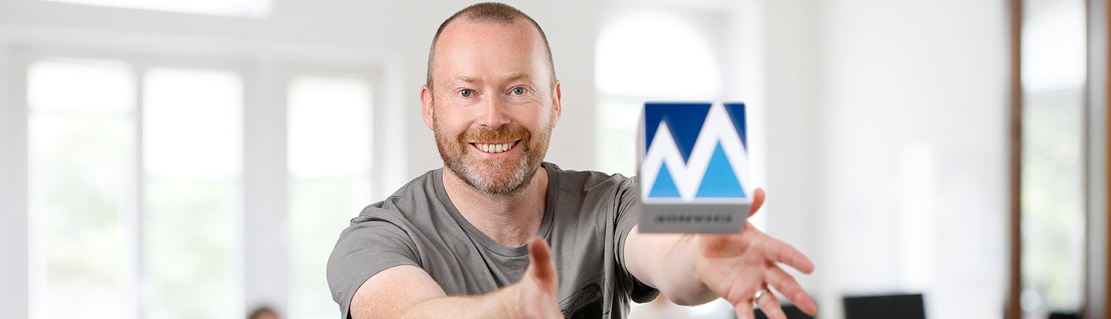
We have recently merged with OARIS, so Kurt Meister and myself decided that this was an ideal time to finalise the branding and launch it with the formal merger. This meant re-working our web presence, taking new photos of our team and updating a lot of the texts and brochures; our marketing team had a lot of work to do!
So, as of the 13th of March, after a long wait, we finally have our new logo:
If you are thinking about revamping your company image, my suggestions to you would be:
Overview MACD logo development